“It is not about how much information there is, but rather how effectively it is arranged.”
-Edward Tufte
It’s only appropriate to start a post on design with an Edward Tufte quote, I suppose. That said, I often find this quote very appropriate when faced with a challenging design task. It can be easy to blame design problems on your data, and indeed, data can be difficult. Facing a challenge, one of the first things the designer should ask is ‘how can I rearrange this and still tell my story?’ How you approach the design can go a very long way in creating a composition that is legible and effective and at the same time beautiful and professional.
The goal of the following is to present a simple set of goals for the novice designer that can help you rethink your design. Here are nine ‘habits’ of an effective designer, in no order of importance, accompanied by some easy guidelines and fun examples.
Nine Habits of Effective Designers
1. Less is always more.
- When in doubt, keep it simple.
- The effective use of negative space is a hallmark of good design – design the negative space just as you would the positive space. Ask yourself: “What elements can I remove or simplify and still retain my message?” Pare it down to the essentials.
- For repetitive information, remember the “rule of small multiples”.
- Remove noise. If it doesn’t need to be there, don’t include it.

Source: Boston Red Sox, MLB.com
2. Be hierarchical.
- Communicate the relative importance of data through variations in size, weight, and intensity.
- You should be able to squint and clearly understand a simple hierarchy of your composition.
- Establish a clear visual hierarchy based on the relative importance of elements around the graphic.

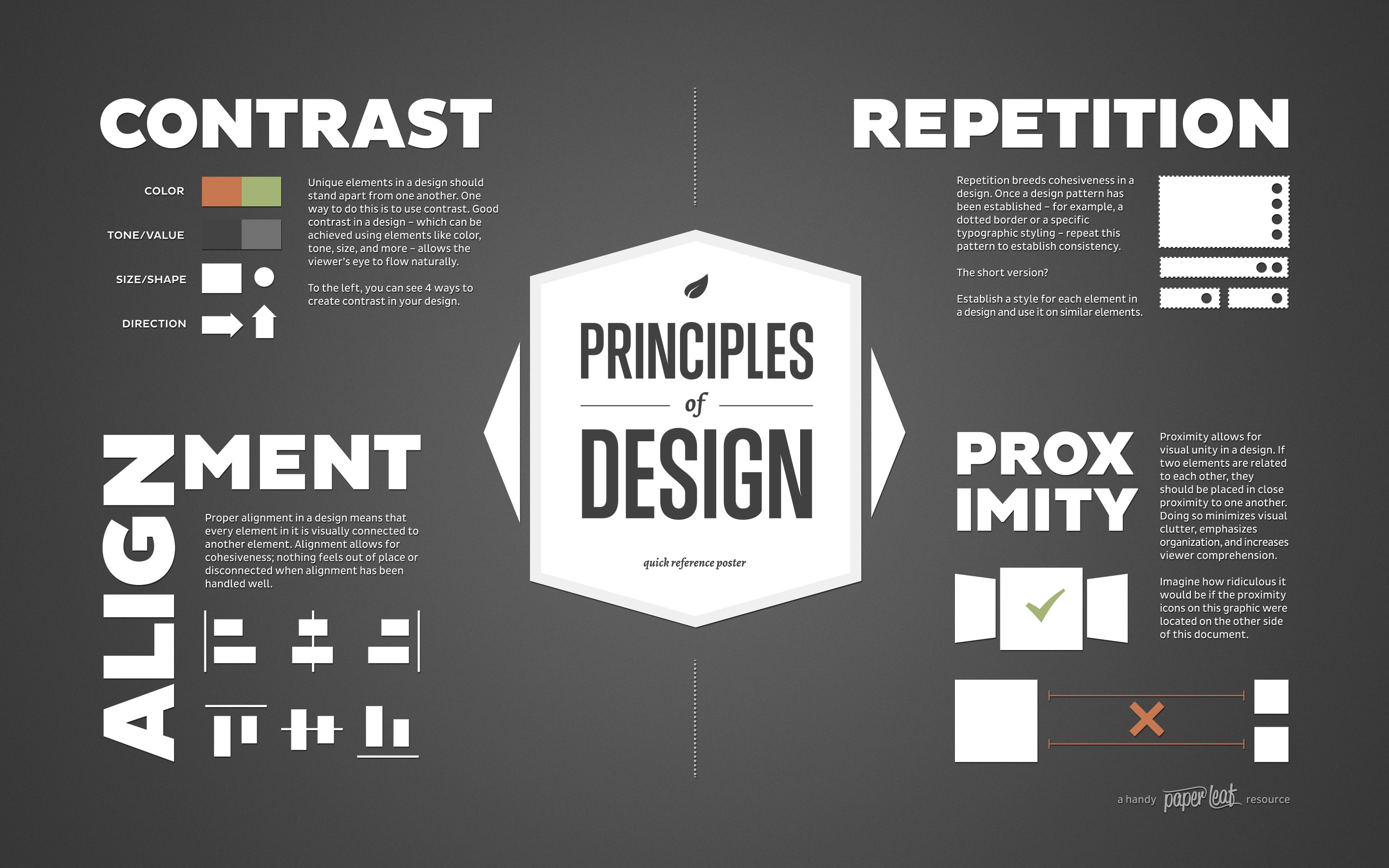
3. Good design has C.R.A.P.
- It’s okay if you have a lot to fit.
- Contrast
- Repetition
- Alignment
- Proximity
- Use these principles to allow your audience to easily follow the connection between your ideas and the various elements of your graphic composition.
4. Just two fonts.
- Good design can be achieved with just one or two fonts.
- The most useful fonts have many weights to choose from.
- Choose one serif font, and one sans serif font.
- Encode your graphic messages into your font.
- Look no further than the Webster dictionary:

Source: Oxford English Dictionary
If you are looking for some fonts to get you started…

5. Magic number 12.
- The human mind looks for natural proportions of 2, 3, and 4.
- As the least common denominator, 12 can be an extremely useful number for column layout, and it’s a good point size multiple for fonts.
- Rule of thumb for prose and text blocks, text should be no more than 60 characters wide.
- Print graphics: use no smaller than 6 point
- Screen-based graphics: use no smaller than 10 point

6. Imitate.
- Beg, borrow – but don’t steal – ideas for beautiful logos, graphics, and graphics from experienced and respected designers.
- One of the best ways to learn. Over time you will see what you like, and your own style will emerge.


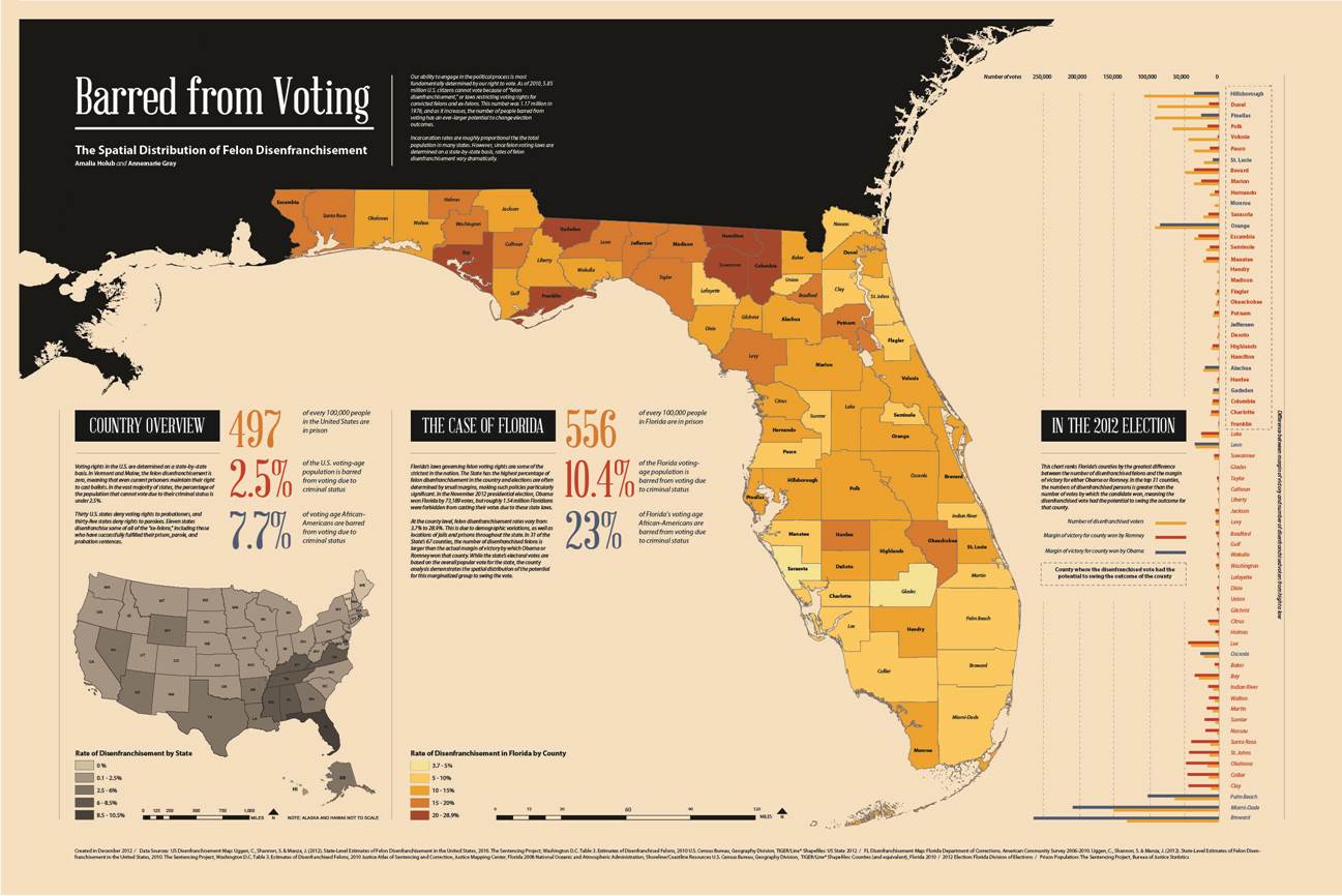
Source: Annemarie Gray
7. Be color conscious.
- Like a well-written paragraph, each graphic should have a singular message. Use color in a consistent manner to create a coherent and complete message for your graphic composition.
- Use color and contrast to highlight differences.
- Color often helps form the first impression of your design composition, and sometimes the first impression is the lasting impression.
- Color encodes implied meaning and bias. Be aware of the unintentional meanings.

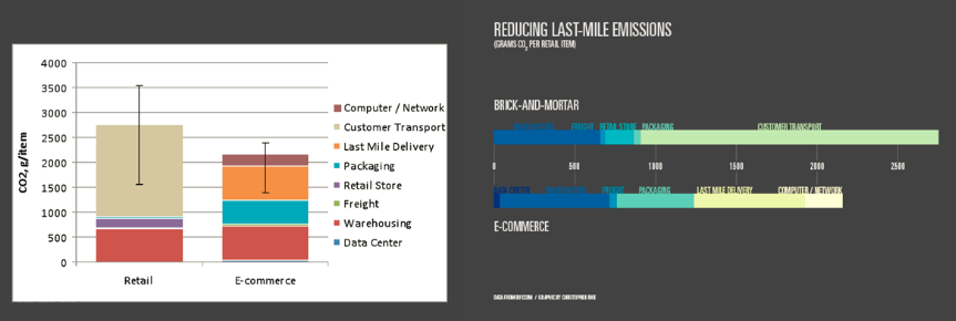
Source: Christopher Rhie
8. Don’t go off the grid.
- Effective graphics follow strict principles of alignment, justification, and position.
- Layout matters: grid your design for a clean and professional finish.
- Create a template that you can use and refer to moving forward.
- Visual center of the page is slightly higher than the geometric center.

9. Design at size.
- Layout your graphics at the proper size before you proceed with your creation process.
- Scaling graphics can be tempting when working with design software.
- Goal: Never scale your graphics up or down.
- If you have to scale, scale down, lest you end up with the following…
![]()
Effective design can be lasting and powerful
Habits are established over time, over time, you will develop your own. In the end, practice makes perfect.

Russian Campaign of 1812, Charles Joseph Minard
Graphics tell stories, and good stories can be engaging, informative, beautiful, and timeless.
Special acknowledgement to Annemarie Gray and Christopher Rhie, whose combined design brilliance helped develop and inspire these habits.


