Category Archives: Cartography

Directional Cartography: Maps and Relative Direction

Map orientation shapes perception of the world around us

It’s pretty common to describe direction in relation to location on a map. Go up that way, down here, or over there. Up, down, and over are relative directions given from a point of reference, often physical topographic change. Up river, down the hill, and over to the lake. Sometimes though, place names become engrained in our cultural lexicon simply because of their location on the map. When is up ‘actually’ up? And when is up constructed by decision of the cartographer? How do decisions by cartographers shape our mental image of place?

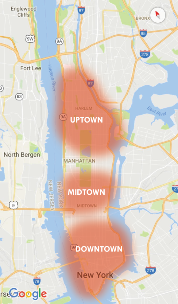
Modern cartographic standard almost always places north at the top of the page. This is not universally true, historic Middle Eastern maps placed east at the top, and cartographers aiming to combat a history of northern imperialism have ‘flipped’ the world map upside down since the 1930s. Considered though, to what effect has cartographic choice on relative directionality had on the establishment of local direction-centric lexicon? Where are local uses of relative direction (ie up or down) based on cartography, versus a geographic reason or topographic change? Looking around for examples, New York City actually covers both bases. Uptown in Manhattan is not only at the top of the map, its also ‘up the Hudson’, and downtown is at the bottom of the map.

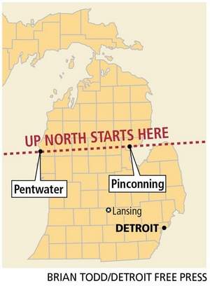
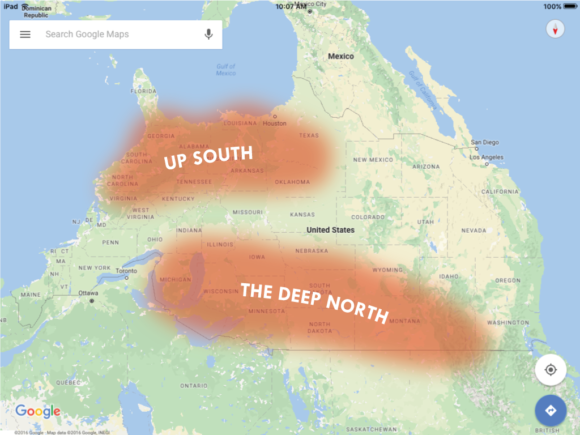
Maps construct reality as much as they are shaped by it. Over time, many regional lexicons have developed simply based on map orientation. For example, in the Upper Midwest, going “up north” means a getaway to the wilderness in the north. Looking ‘down south’, the ‘deep south’ might be considered deep only because it is so far from the top. One travels “over east” when traveling from the interior to the country to East Coast. Globes almost always place the north pole at the top, which is in theory, arbitrary, and most view the world through the distorted parlance of Mercator. Map orientation shapes our sense of the world and the places around us.

Where are uses of relative direction are actually based on cartography?

Which local references to direction (up or down) were actually created in relative reference to mapping and cartography, as opposed to geographic reason or topographic change? The answer is qualitative, fuzzy, and everywhere. The terms up and down can be held relative to gravity, but holding them reference to a scaled representation of earth actually doesn’t make much sense. Unless you are referring to up and down in relation to topography, or relative to a certain location (ie upstream refers to water coming from a higher elevation), up and down are meaningless terms unless the common representation of the place is in a certain spot on the map. Perhaps the most egregious misuse of these relative directions is the land ‘Down Under’, Australia, given this name due to is location at the bottom of the globe.

Map Orientation affects Perception and Recognition of Space

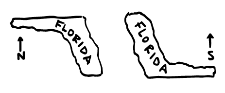
Say you were to ask a friend to draw the United States. What are the chances they put Florida at the top? Chances are, if Florida is at the top, they would simply say the map is wrong. Technically though, the map isn’t wrong at all… its just, different. It represents the same locations.

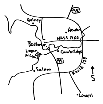
Map readers construct cognitive maps based on gained or learned geographic knowledge of the areas in which they live and operate. Mental maps of the United States almost always have the northern tier of states at the top. The maps are built around coastlines, major highways, and key points of interest. For example, look at the Greater Boston. Most have a vivid mental picture defined by shorelines and freeways. Route 128 circling the city to the left, downtown jutting out to the northeast in the center, and the harbor islands and beaches dominating the right side of the map.

Some cities flipped in a direction where north is not the top become immediately foreign, even though the map depicts the the exact same accuracy and resolution as any map with north at the top. Flipping south to the top challenges our mental image of the place and changes the paradigm in which we have built our internal navigation and recognition models. When this construction changes, a well known area can look like an entirely foreign location.

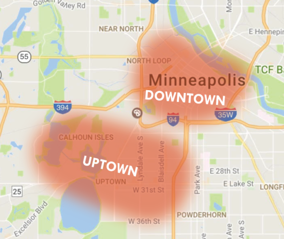
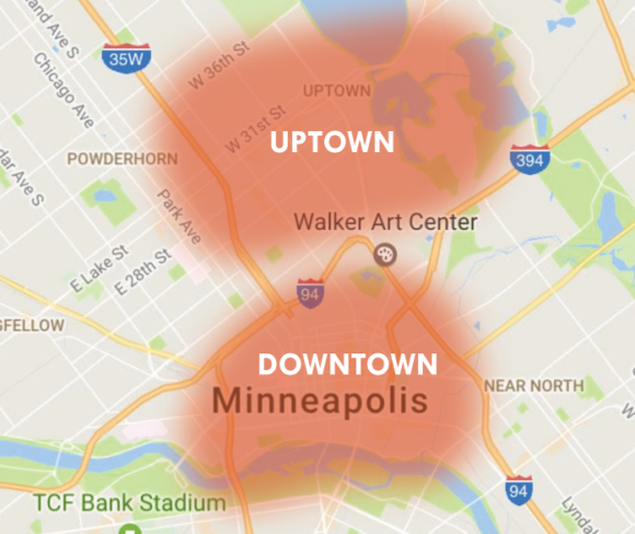
Digging around a bit, you find evidence of relative directionality all over the map, each begging a story that narrates why these places have been given these names. Take Uptown, a well known neighborhood in Minneapolis. Cartographically, why is ‘Uptown’ located below ‘Downtown’?

The roots can be found in the historical development of the city. Uptown, in this circumstance, is up and away from the Mississippi River. Many historical maps of Minneapolis use the Mississippi as a geographic foundation for the map, and anything moved away from the river is also ‘up’ the map.

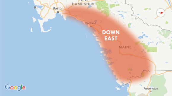
New England is a curious example. Traveling ‘downeast’ in New England actually takes you north! This was not based on map orientation, but rather on prevailing winds traveling from southwest to northeast. Historically, sailing ships going to the east would be sailing downwind from the settlements around the greater Boston area to get Maine and other points further north.

Cartographic decisions produce identity as much as they represent it, and locally relevant directional cognition has developed based on a cartographers decisions on what to put at the top of the map. It’s very simple to change map orientation, but over time, it can become foundational to a readers perception of space and how they perceive the world around them. Entire regions of our country, in part, can be traced to cartographic origins. Depicting those regions in any other way is technically accurate, and provides insight into how the people of the area have built their mental images of space into their greater culture.

This is a small sample, but there are many different locations around the world where position on the map has provided identity of place. There are probably some in your city, and you can probably find them on the map.

Why don’t we go “Up South”? Because somewhere a cartographer decided to put north at the top of the map. 

The Baseball Map: Who’s in town today?

Mapping Out the 2016 Baseball Season

Visually tracking your team, and who and when they are playing, during a 180 day pennant marathon can be tricky… team schedules tend to be decentralized, tabular, and kind of boring. The aim of this map is to provide a visual schedule of the season, giving easy access to where each game in the MLB is being played by each team on each day. Follow the boys of summer through the long, grueling season, and easily find if you can grab a beer, a hot dog, and a ticket to catch your team any day. Enter the city you’re in and the team you want to follow to visualize their location and opponent on that day. Hit play and watch them travel!

Screen Shot 2016-04-03 at 11.14.29 PM

There is, of course, one team playing in the “Great White North”… be careful, your team might fall of the map when visiting.

Screen Shot 2016-04-03 at 11.21.28 PM

Play the map to get a visual of each day.

Screen Shot 2016-04-03 at 11.22.07 PM

The cartographic baseball schedule is created using D3, the 2016 MLB Schedule, some fantastic ballpark geographies from James Fee, and the SportsRadarUS API.

Happy Opening Day!

Go to the map!

Mapping Twin Cities Neighborhoods

Drawing a map of the city based on how we live in the city

What makes a neighborhood? Many things may come to mind… including the people you live with, the places you frequent, and the locations you call home. Neighborhoods are the physical locations in which people connect with the city in which they live. They are dynamic and changing, yet static, they are unique and individual, yet universal. They are the living rooms of the city, where residents live, work, and play. Neighborhoods become part of your identity.

A collection of local hubs – Between Minneapolis and St. Paul, there are over 100 unique and distinctive neighborhoods, and more if you start to count the surrounding suburbs. Officially, Minneapolis has 81 neighborhoods, 72 of which are represented by organizations operated by the residents and businesses that live and operate within their boundaries. St. Paul has 15. St. Louis Park has 27. Edina has 45!

The city is a sum of its neighborhoods, both the official ones and unofficial ones, and each is defined by the people who live, work, and play in them.

What are the Neighborhoods of the Twin Cities?

Help make the most accurate map of Minneapolis and St. Paul yet.

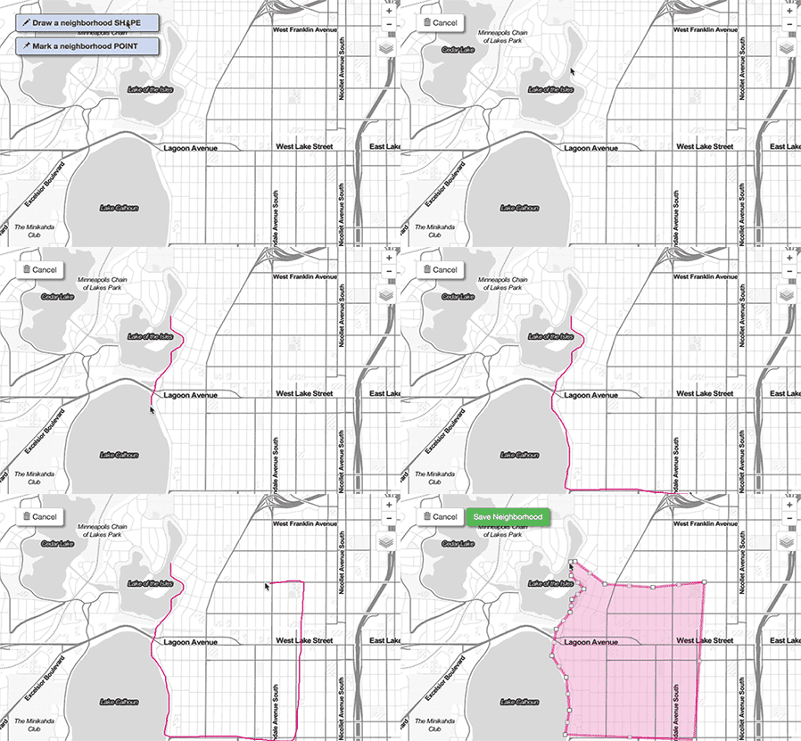
You draw the neighborhood.

You draw the neighborhood.

This project creates a crowd-sourced map of the Twin Cities Metro Area representing the city through the eyes of the people. In the application, no neighborhood names or boundaries are here to start with. You make the map. Real or imagined, within a city, or crossing municipal borders. Names, extents, and descriptions are up to you. After mapping, be sure to View Maps to see other people’s contributions.

North Loop Neighborhood - Minneapolis

North Loop Neighborhood – Minneapolis

Draw your City

Visit the Application. Map your neighborhood, Twin Cities!


The Technology Behind

“Map your neighborhood, Twin Cities!” is built using LeafletJS and CartoDB. This project is coded on top of projects in Portland by Nick Martinelli (Thanks Nick!) and Boston by Bostonography (Thank you, Andy Woodruff and Tim Wallace).


Visit the Application. Map your neighborhood, Twin Cities!

Geography for the Non-Geographer

Geography, the science and study, is wide reaching, cross-cutting, and diverse. Spatial concepts, geographic fundamentals, analytical methods, and data maps are helpful or even critical in many disparate fields, see applications in Urban and Regional Planning, Environmental Studies, Public Health, Geology, Architecture, Journalism, and Civil Engineering.

As fields of study, Human and Physical Geography, Cartography, and GIS, are populated not only with professionals and academics, but also many enthusiasts and fanatics. The nature of spatial thought, geographic problem solving, and all of the related technologies attract a distinctive set of individuals both by trade and hobby that make for a unique and strong community, but must be careful of insularity and isolation from the industries and sciences that could it could benefit most. Interaction with the non-enthusiast is important. Geographers should be proactive and inventive, applying technology to existing methods, devising new problem solving techniques, and viewing applications in other fields as opportunity, not threat.

The focus of Geographic science, theory, and method should not be isolated, but rather seek to determine how geography can actively complement other sciences and industries, something the field is inherently tuned for. This necessitates introspection and a careful look at the field is presented to the non-fanatics, non-enthusiasts, and outside experts.

A Field of Specialized Generalists

The pervasiveness of geographic methods and the applicability of the spatial sciences in so many different fields might suggest that most outside geography view the field as a utilitarian driven enterprise, one wrapped up in a handful of software companies. The view is vastly different than that of a trained geographer, or even the so-called enthusiast or hobbyist. The science and tools of Geography are a piece of the problem solving equation, just like math and physics, but the exact tools and means of use are less prescribed.

Geographic method is often necessitated through questioning and as a means to an end. For example, what can be done to reduce poverty in my city? How can we affect policy to reduce greenhouse gas emissions? Where should I relocate my business? Or, how can I improve the life expectancy of the people in my community? These questions are inherently spatial, but often the questions are conceived by specialists in unrelated fields seeking solutions to problems. In depth knowledge of the specific problem itself is often required, in addition to spatial knowledge.

Data Analyst + Writer + Graphic Designer + Database Administrator + Front-End Programmer + Server-Side Developer + UIUX Expert + Subject Specialist + Statistician = Modern Cartographer

Geographers serve to bring their expertise to a wide array of problems and issues and are conditioned to look at the world through a different lens, one that is focused on spatial methods, tools, laws, and algorithms. Ultimately, the preceding has made Geography a field of generalists solving problems in a world of specialists. For example, modern cartographers, trained in spatial thought and design, are asked not only to be aware of geographic methods and cartographic principles, but also serve as writers, graphic designers, data analysts, statisticians, database administrators, front-end programmers, server-side developers, and UIUX experts in communicating spatial content and answers to the non-geographer.

This leads to important questions. How do we, as a field, guide Geography and communicate the importance of Geographic thought and process in larger organizations? Where do specialized generalists fit into these organizations? In what areas can expertise be shared, and what areas do Geographers own? How can we build a knowledgebase that serves to educate non-geographers on methods, tools, and concepts associated with spatial problem solving? Answering these questions is critical to the mission of a field so pervasive and universal, and crucial in spreading understanding of geographic thought. To the world:

Knowledge of geographic fundamentals leads to better data, better analysis, and better decisions.

Sharing the Geographic Knowledgebase

Spatial scientists are tasked with advancing the field and also tasked with distilling the field into components that can be utilized to allow non-geographers to intelligently answer questions using the concepts and principles of space. This is an important and challenging task. There are many methods to do this. The point is to erase a history of complacency and fear of technology by owning the field and actively declaring expertise. When it comes to sharing knowledge, distilling information and components for non-Geographers is important. Demand is there, see the proliferation of online Map Schools, Map Academies, and community-driven Mapping meetups.

Perhaps a modular approach in teaching non-Geographers is best, but one that can only be designed and run by trained geographers, educators, and field experts well versed in geographic theory and history, keeping a focus on concepts that are manifesting through the tools, and communicating and conveying the small pieces of a larger field that apply to the specific task at hand. The science of geography just so happens to be a fantastic complement to an incredible number of other sciences, especially in the modern context, this should be something leaders in the field own, rather than shy away from, and work to build strong bonds across industries. A modular approach should be viewed critically, welcomed as a way to move faster than bureacracy and red tape will allow, but cautiously aware of oversimplifying the field. Meetups should not replace advanced theory, development of tools, and critical thought.

That said, an urban planner will not care about learning spatial analysis techniques with the goal of becoming a GIS Specialist, nor will they want to learn Python with the end goal of becoming a computer programmer, but rather care to learn Python and spatial analsis methods as a means to find answers and get results. The specifics might not matter, but knowledge of the concepts and tools in a practical and applicable manner are important. Parts of geographic thought and geographic technology are relevant to various fields, and getting this message to those fields is important. Non-geographers don’t need to get caught in the weeds, but need to know that the focus is approach, and there is no one answer to their problem.

“By making it easier, our clients think it is easier. It is not.”
Michael Batty

A New Marketing Department

As a field, geography is wide and diverse. You hear the terms neo-, paleo-, and even hipster thrown around regularly, sometimes with little unity. The field needs stop deciding between concepts and tools, and declare what it is: a cross-cutting, universal base of knowledge that needs sustained exploration and development originating from technological, scientific, and critical paradigms. Whatever the identify of Geography ends up manifesting as, it needs be unified and concrete, one that can be used to not unite practitioners and professionals and also serve to build a better picture of what is required to build, develop, and implement geospatial solutions and answers in a modern location-driven society.

The tool vs. concept debate misses the point, geography is both.

Geography and GIS shouldn’t be viewed as an exclusive group for those only with proper training or enough money to pay for an expensive software license. (This hasn’t treated us very well in the past…) Software is only a part of the picture, just as fundamentals and concepts are only a part of the picture. The ability to communicate this to non-geographers and non-enthusiasts is one of the most important pieces of the puzzle for the geographic sciences to address.

The debate surrounding the Geography and GIS is not tool vs. concept, the field is both. The debate is more on the best ways to build a robust knowledgebase and tool infrastructure for the future. Research is need on best solutions for automated data management, and topics such as automated generalization, projection, and spatial analytics such as correlation and hot spot analysis. The mission should be to continue building the core of geography, developing new techniques and methods to address spatial problems, and then manifest these techniques and methods through new tools that make it accessible to non-geographers. The field of Geography should proudly stand as a field of specialized generalists, or generalized specialists, and unite to solve problems in a world that is increasingly dependent on location and spatial thought.

The Lost Art of Critical Map Reading

In a world of budding novice mapmakers and shares, likes, and retweets, we have never seen maps and graphics appear, circulate, and educate as much as they do right now. Maps are an engaging way to visualize data and gain knowledge.  Geovisualization, cartography, and analysis are not only relevant, but highly visible to the mainstream, and it is great for the field. The New York Times and Washington Post, among many, lead the way with excellent, high quality, and reputable maps and graphics. We’ve all seen the forty maps that change your view of the world.

There is another side to this though, that of the mapmaker, specialist, or blogger that catches or creates a map, and in a whim of ‘This is cool!’ and with knowledge that they have a listening audience, relays the map into the internet universe. Little regard is sometimes taken in the validity or interpretation of the map and its data, or how it should be framed to the greater public. ‘Bad maps’, they could be called, are not new, but they now exist on an widely accessible mainstream level, and are fueled by Twitter retweets and Facebook shares.

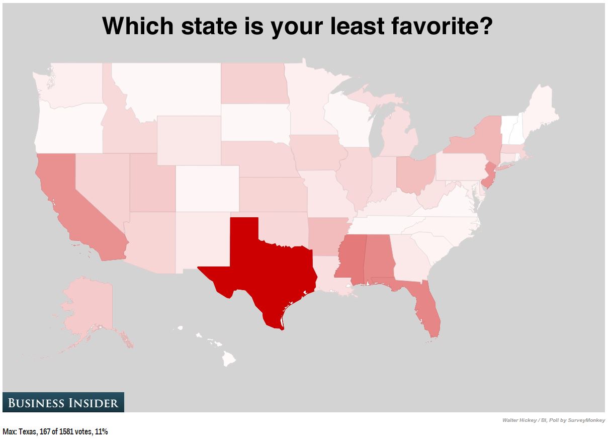
least favorite

Obviously. (via Business Insider)

The ‘bad maps’ exist in multiple forms, starting with those that could be considered ugly (or graphically undesireable); those that might mislead readers; and then those that are just plain wrong. Maps that are simply ugly are not ‘bad maps’, per se. They communicate a message, convey a story, and serve to educate many. The quest to identify and improve these maps or even defend these maps, is emerging. Many talented and experienced cartographers and designers have initiated some great discussion on the topic, and poked plenty of fun at the issue. Virality of maps has become an important topic. Awareness of the issues will only improve cartography and data visualization in the long run.

That said, more troubling are the latter maps that are wrong or misleading, yet still gain the aforementioned viral steam and exposure. This discussion exposes a greater, more concerning problem that needs to be discussed – a pervasive lack of critical map reading skills.

Critical map reading takes the greater pedagogy of critical reading and applies it to maps and visual graphics. It is a form of map reading that does not take a map at face value, but instead examines the data, authors, sources, presentation, and prose of a map, investigating the claims those components assert. Maps are a unique medium in which every part of the composition is data. Given their inherent ability to relate specific topics to the earth we live on, maps are often viewed as truth and fact, and are rarely challenged. However, at the same time maps are storytellers, providing rich illustrations and the ability for interpretation. Cartographers mix these ingredients in a powerful and compelling manner, and many in the general public are largely blind to the concept that maps and visual graphics can be disputed.

Part of the allure of a map is that it encourages the ability to interpret and explore. All maps contain a message, the practice of map reading is discerning and resolving that message. It is the questions that now become important. What makes this map “the most accurate”? Why is this map “incredible”? What methods where used on the data shown? Is a map the best way to show this data?

The route to critical map reading might not be clear, but awareness is perhaps the best place to start. Here are five simple habits that will improve map reading abilities.

Read all textual components and prose on the map carefully

Maps use both visual and textual communication methods. Even the most well designed map is nothing without context. Textual communication assists the reader in better understanding and interpreting the product. This content includes source information, titles, authors and affiliated organizations, and cartographic prose. Critical reading of this information will inform on how to properly intepret the product and relay it to others. Martin Elmer writes a well done piece on map prose here.

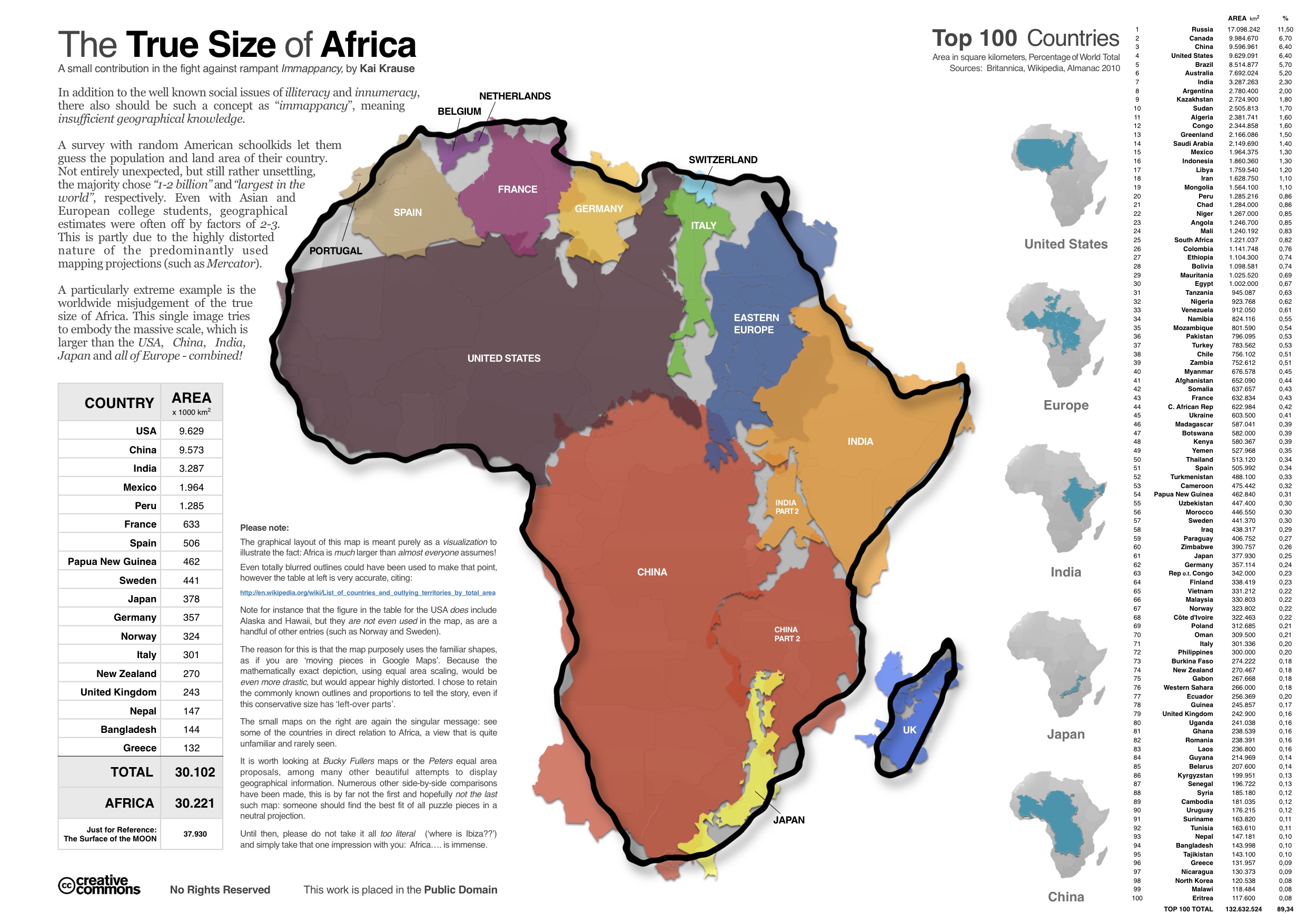
The-True-Size-of-Africa

Note the ‘Please Note’. It will probably have a note that helps you understand the map. Or what the map isn’t.

Learn as much as possible about the data being shown on the map

Know the limitations of your data, and the constraints of the it’s graphical representation. Ask about the methods that acquired the data, and whether or not it has been summarized or simplifed in some form before being displayed. Data sources and original links can usually around the fringe of the map. Focus here on collection methods and manipulation tactics. Determine for yourself whether or not these are the best data sources to show the information, or whether or not the methods used are appropriate. Ask yourself, is the data qualitative or quantitative? Categorical or nominal?

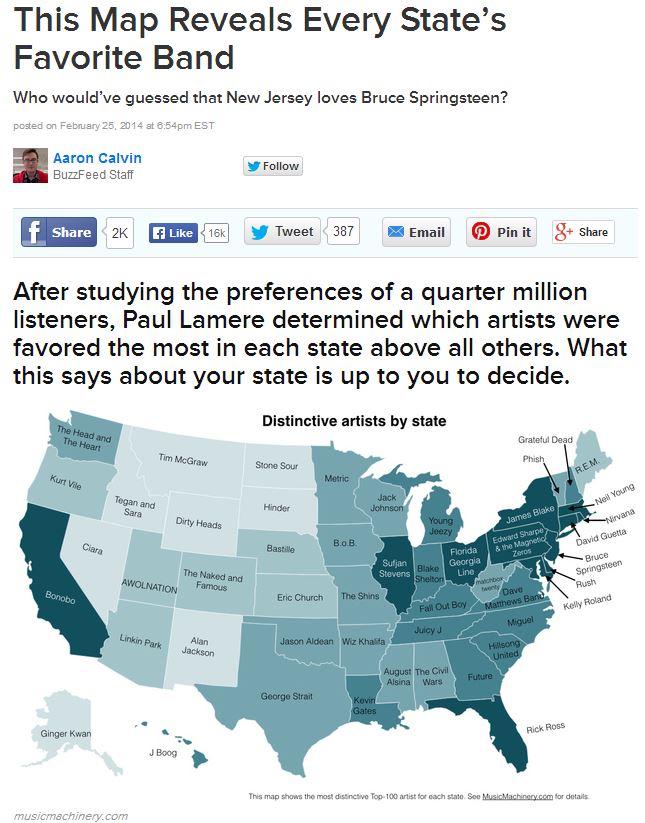
buzzfeed_favorite_band

This is not showing every state’s favorite band. The data and sources will expose this. (via MusicMachinery.com, Buzzfeed.com)

Note that everything on a map can be considered data

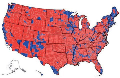
Falling close in line next, maps are unique in that not only the subject matter is data, the entire presentation can be considered data. A basemap of the United States is just as much ‘data’ as the points and colors scattered across it, along with the areal enumeration units. Sample case, some counties in California are the size of Massachusetts, yet national maps distilling information by county are common place. Consider how else the data could be shown, or what other options might be available.

election results

I don’t think Romney won, but it looks like he did. (via SkeptimusPrime.com)

Be aware of what the map is NOT saying

Just as everything on a map can be considered data, critical map reading involves consideration of what is not shown on the map. Ask what data could be shown in complement with the data being displayed, or what additional variables or regions could be shown to improve the output of this map. Here lies the concept of ecological fallacy, in which information about individuals is deduced from the inference for the group to which they belong. Derive for yourself the strongest statements you can make from the data presented. 

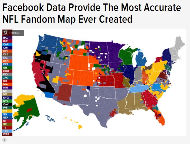
football-fandom

This might not represent ‘your’ favorite football team. This map isn’t wrong, its just also not necessarily… right. The Broncos sure are important though! (via Deadspin and CommonCensus)

Notice that graphic representation and color encode bias and implied meaning

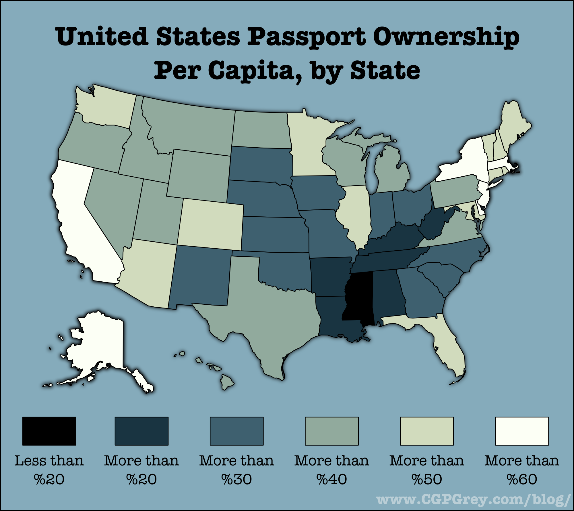
Maps visually communiate through a handful of variables. Perhaps the most quickly interpretable is the use of color and emphasize and exclamate points. Dark, bold colors imply importance, while washed out, desaturated colors imply the opposite. The chosen colors are a conscious (or unknowing) design decision made by the map author, and strongly affects reader interpretation. Envision changing the color scheme, or categorization method, and seeing how that affects the gravity of the map.

passport-possession

So Mississippi is the best? It’s the darkest. No, wait, is having a passport good or bad? What kind of color scheme is this? (via CPgrey.com)

Getting into these habits will help distill the the true message of the map, improve ability to gain knowledge from the map, and assist in interpreting a greater meaning about yourself and your surroundings. More reading abounds on this topic, and goes into much greater depth. Notably, Mark Monmonier’s How to Lie with Maps is perhaps the proverbial work on this topic, along with great reads by Denis Wood and Jeremy Crampton. Even the best designed maps require context and a critical eye. 

In an era of information overload and retweets, critical thought of what is posted to and passes through our feeds is often overlooked. As maps and big data go mainstream, and visualizations become more prominent, educating map readers on critical interpretation becomes more important.

This is all almost as important as educating budding map makers on another thing… critical map making.

The Land of Coding: Cartography and the Embrace of Technology

Somewhere in the past few decades, cartographers have lost the control of cartography. How could this happen? Can we get it back?

This past fall, I co-taught an introductory GIS and Cartography class in a department of future urban planners. Many great questions were brought up and discussed through the duration of the course, some I would hear more than others. Two of the biggest questions were often in tandem. “Should I learn to code?” and more specifically, “what language should I learn to code in?” My answers were always, “Yes, you should!” and “Anything!” – The reasons for these answers are obvious, I suppose. Learning to program involves a paradigm shift, and you have to be taught what this shift is and should look like. Learning one language will allow you the paradigm that you need to pick up other languages more efficiently. Once you can change and establish your basic assumptions, it becomes a classic example of the law of increasing returns. A coder learning new functions is much like a linguist learning new verbs.

Perhaps the most important professional attribute one can have in our modern society is the ability to learn and pick up new technologies quickly. When learning a new technology, don’t focus on the tool itself as much as the concepts and fundamentals that manifest themselves through the tool. Same goes for coding. Many of the basics from one language to the next, or from one library to the next, will transfer, not to say you won’t have to bury yourself in syntax references for a while.

To an extremely visual person, learning to code can be a tough task. Taking yourself from the world of visually choosing colors from a palette to being more concerned about what specific hex codes are is not a very scintillating prospect, and going to a place where you generalize a map by creating an algorithm consisting of “if and for” loops quite frankly sounds super boring. One has to get to the point where it becomes a puzzle and you are using the pieces to help solve a task, do this and you will no longer see just a string of strange characters.

Much to my dismay, and unfortunately to the huge detriment of the field, geographers, and specifically cartographers, have been slow to embrace coding. I would largely attribute this to the fact that the history of cartography is very visual. The craft and science has revolved around the illustrative, visual representation of location and earth for hundreds, if not thousands of years. While fundamentally scientific, in practice cartography is an ultimate exercise in communication and design. In the 1980’s when GIS was beginning to take hold and technology started to explode, software made really (like, really) ugly maps, leaving many cartographers to write it off, think of it only as a data utility, then quickly return to familiar and well-known visual mediums for geographic representation. As such, we have lost our hold as the creators and keepers of maps. Cartographers, as such, did not embrace coding as a new tool for creating maps. This in hindsight was a monumental mistake.

Because maps and location are so prevalent in society, the field did not die, but it must now be shared with computer scientists, data programmers, and professions everywhere that may have little knowledge of the intricacies of geographic data, longstanding cartographic conventions, and proper spatial science techniques. Is this a bad thing? I don’t know, probably not. Cartography, even if it goes under the guise of “infographic” or “data visualization” has seen a renaissance in the last ten years as location-based services and spatial data management and visualization software has exploded. Some have even argued a golden age. Can we take back control? Probably not in full. Can we embrace what it has become, absolutely.

In many professions, coding is a buzzword, but to those in the spatial industry, be it geography, visualization, planning, or whatever, get yourself in the proper paradigm to carry the field into the future. The professional world and nature of mapping have changed. To survive, you must have a useful, relevant, and utility-driven work belt, and make sure that being able to create and design through the use of code is one of the tools you have in it.


A Better Bike Map: Reimagining Your Design

Creating a map geared towards bike transportation is a challenging task, but a relevant one. With an urbanizing, mobile population and a growing need to find fast, efficient, and cheap alternatives to automobile transportation, effective communication of bicycle routes and associated bicycle-friendly infrastructure is becoming more important. The major problem is that most bike maps, due to the nature of their content, easily get crowded, cluttered, and hard to read. This requires a paradigm shift, and finding where the happy medium of effective content and supplemental information exists. This post is the first in a series that will discuss what cartographic characteristics make an effective bike map. We will ask and attempt to answer a number of questions, and then provide a high level survey on the state of bike maps while suggesting some optimal solutions.

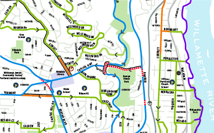
On the vast spectrum of viable transportation choices, a bicycle is one of the few options that is not a motorized vehicle but still allows for a large amount of personal mobility and freedom. Less intrusive than a scooter or moped, more practical than a skateboard or rollerblades, a bike fits somewhere in the vicinity of half car/half pedestrian. A bicyclist can go just about anywhere with only a handful of limited restrictions, but can also effectively flow with automobile traffic down major roads, and when doing so must follow the rules of the road (Ever gotten pulled over for running a red light on a bike?). But a bike is not a car, and the flexible nature of biking and lack of exclusive bicycle infrastructure in most urban areas make creating an effective bike map a challenging task that remains open to much interpretation and subjectivity. You can see this in the handful of bike maps in the illustration below, where as opposed to a traditional road map, it becomes very hard to intuitively distinguish what each feature is.

citysamples-01So this begs a number of questions. Does a holy grail for how to create the “perfect” bike map exist? What kinds of wayfinding tools can address this and direct bikers towards efficient and safe navigable routes? With the large amount of interpretation, subjectivity, and non-exclusive use bicycle infrastructure, what criteria can be defined that will refine content and make the ideal bike map?

From a design perspective the best way to address these questions is to simplify them, and of course ask a few more. What is important to a cyclist? What do they need to navigate? What features on a map are necessary to facilitate the most efficient bike transport? Where are they trying to go? Are riders commuters or recreational? The following are three important considerations in bike map design that help answer these questions, each important in its own right. They include knowing your community and its infrastructure, rethinking your design hierarchy, and awareness of technologies that might provide the most effective ways to convey your map and its content to the user.

1. Know your community and it’s infrastructure

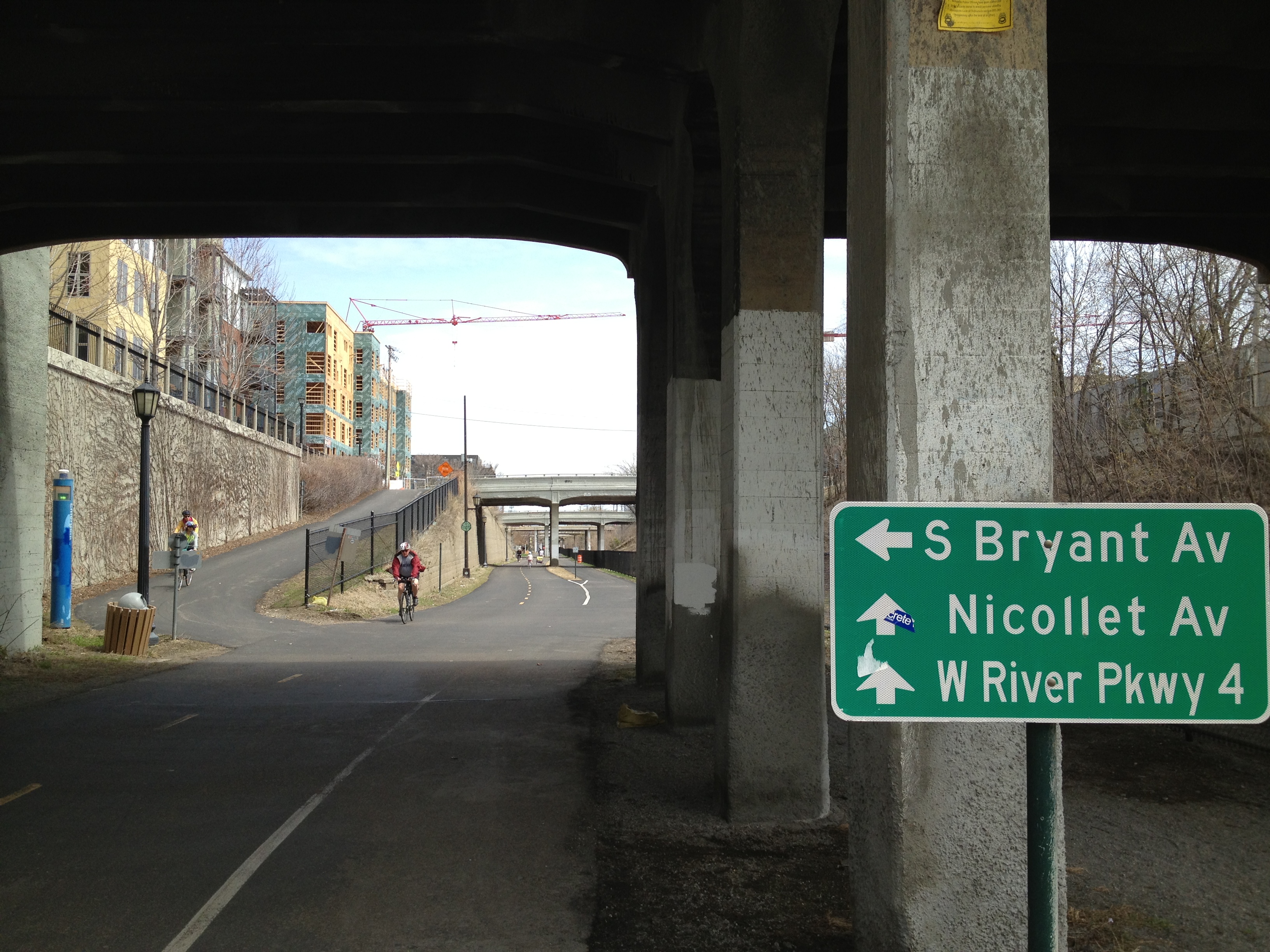
2013-05-05 13.52.16

Midtown Greenway “Bike Highway” – Minneapolis

Perhaps the most important component of effective bike map design is knowing your local community. Specifically, knowledge on the extent, location, and quality of the physical bicycle infrastructure in the region, along with familiarity on the users of that infrastructure (commuters? recreation? both?). Spatial data on bike routes and trails, if it exists, is rarely kept in a single central location and is often maintained by a number of different organizations, ranging from local park board websites to state natural resources offices. Collecting it and customizing it to your needs and the needs of the cycling community is not a simple task. Physical bicycle infrastructure can include grade-separated routes, off-street bike trails, on-street bike lanes, designating cycling streets, and bike boulevards. In addition to these features, the designer must be also be aware of features that may not be clearly distinguished in existing spatial dataset. Determination of other bicycle-centric features, such as service stops, bike shops, and parking locations, will require some subjective distilling of information from existing geographic data. To complicate things a bit more, many cities around the world are diligently investing in bike infrastructure and facilities are changing at a rapid pace. Ensure the map is easy to update, and note where new and future bike infrastructure exists or is under construction.

2. Redefine your visual hierarchy

Portland, OR - Lesser important roads de-emphasized, but color scheme still unclear.

Portland, OR – Lesser important roads de-emphasized, but color scheme still unclear.

Bikes are not cars. A biker does not want to be riding down a major thoroughfare, nor does the rider want to be biking in areas with many natural, physical obstacles that may be irrelevant to those in a car. This requires reimagining your city and viewing it from the paradigm as if the major car-centric features are not there, or exist as notable landmarks and navigation points rather than a network of routes. Certain features that are important on a road map lose importance, for example, you cannot bike down an interstate. The interstate however will likely remain an important feature to include as it will give your readers context and a benchmark for navigation. Redefining the cartographic hierarchy will perhaps radically change the appearance of maps of the region, as different features than are normally called out are made to look more important, and defining features on other maps are given lesser emphasis. Krygier and Wood provide a well written summary of intellectual and visual hierarchy here.

3. Determine the map capabilities and means of distribution

Cyclopath: OpenStreetMap for Biking

Cyclopath: OpenStreetMap for Biking

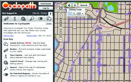
Also important is the means by which the user consumes the map, for example, a cyclist likely won’t use a map that only works effectively on his desktop computer at the office. This of course makes either mobile device based maps or paper maps the optimal means of conveyance. It must be considered that most bikes don’t have on-board navigation nor will they using their cell phones while they ride (I’ve tried, doesn’t work out well…), but many users will still have cell phones with them or have backpacks or pouches for clean, clear paper maps. The user won’t have constant access, but instead require sporadic access on demand. Turn by turn navigation is an interesting topic here, and some mapping giants have attempted this (see Google maps). They have had varying success, due to scarce standardized data and the lack of addressing a true means to reach the rider while he/she is biking. As mentioned above, making the map easy to make changes and update is important, as data changes rapidly as infrastructure grows and changes. One interesting attempt to address this, as well as collect an incredible amount of data, is community sourced biking mapping, a method used in projects like Cyclopath, which could be viewed as an OpenStreetMap exclusively for biking. Compare and contrast it to the Google bike maps.

There are a growing number of resources on bike maps out there, and most cities now maintain, or plan to maintain, bike maps for commuters and recreational riders. This post is the first of a short series on creating effective maps for bike transportation that will focus on design criteria and methods of a good bike map, survey, evaluate, and categorize a selection of bike maps, discussing what works and what doesn’t, and finally outline the creation of a new but perhaps familiar style of bike map from concept to completion.

The Minneapolis Bike Freeway System - (c)2013 Graphicarto

A snapshot of The Minneapolis Bike Freeway System map – (c)2013 Graphicarto

Happy Mapping,

-Mike

Mapping Urban Growth: A Cartoanalysis

randMcNallyA catalog of maps, large or small, is a treasure trove of information. A collection that when sitting static is still always growing and always changing. Everyday its value as a temporal benchmark of human growth and innovation increases. The map itself is a snapshot of place and data (or at least a window into the mind of the cartographer) at any given moment in time, but over time the assembling of maps can unveil an incredible subject matter timeline. Alot of cartographers and collectors have commented on this and, in fact, celebrated this.  Personally, I find historical road atlases to be particularly of note in cartographic historic analysis, and one of my favorite days of the year is when the newest annual Rand McNally road atlas is released. In the past I’ve spent hours, days, probably weeks, poring over each page, comparing new to old, observing the changes and progress of the past year. New highways completed, routes renamed, new stadiums, air force bases repurposed to civilian use, two lane roads upgraded to large expressways.

These Rand McNally atlases I speak of have changed over the years, both through design and layout (worth a whole other post in itself), but there are certain consistencies from page to page that have lasted through the years. The consistencies provide the potential for a fascinating qualitative and quantitative temporal analysis of urban progress and growth. What features come onto the map over the years? What fall off? What infrastructure is important, what is superseded?

I began by locating the newest and oldest atlases I had in my library from the annual Rand McNally series. The oldest that would work was the 1986 edition, with a nice Rodeway truck emblazoned on the cover, and the newest (that wasn’t all wrinkled up out in my car) was the 2011. They just happened to sit a quarter century from each other, perfect. With the two subject maps identified, I had to pick a subject area and outline the criteria to do so.  The most important of the criteria, the selected map extent and design style had to be largely unchanged from 1986 to 2011. Many stylistic and scale differences were implemented over the years, so the mapped extent had to be at about the same detail throughout. And finally, the mapped extent had to be a region of extensive urban growth, with many new communities, growing infrastructure, and new points of interest, such as shopping malls and airports.

i215

The subject winner: the massive metroplex of San Bernardino, Ontario, and Riverside in the beautiful San Bernardino Valley in Southern California, known colloquially as the “Inland Empire”. After some edge matching, layer mashing, georeferencing, and a small bit of rubber sheeting… the pictorial results.

sanBern_comparison-01

This first snapshot is of San Bernardino and the immediate vicinity.  Notable changes include the establishment of San Bernardino International Airport on the old Norton Air Force Base grounds, and the massive growth and establishment of community assets (ballparks, shopping centers, civic centers) near the large interchange at Interstate 10 and Interstate 215.  Also noticeable is the completion of the CA-210 Loop around the north and east of the city.  Population of San Bernardino in 1986: 140,000 – Population of San Bernardino in 2011: 205,000

moreno_comparison-01

This second snapshot is Moreno Valley, California, or simply known as Sunnymead in 1986.  This is one of the most extreme examples of urban growth and suburban sprawl in the entire United States during this time.  Moreno Valley was incorporated in 1984, and grew by 70,000 people in the 1980s alone.  The arterial roads remain the same, but quite noticeable are the upgrade of Interstate 215 to freeway standards and the establishment of many community resources, parks, hospitals and centers. Population of Moreno Valley in 1986: 40,000 – Population of Moreno Valley in 2011: 195,000

i15_comparison-01

A third snapshot focuses on the Interstate 15 freeway corridor.  Notable is the establishment of Interstate 15 south of Mira Loma, and superseding of Temp 15 (Hamner Avenue) along that stretch.

Any conclusions or theories drawn are clearly illustrative, but the exploration in itself is engaging and revealing.  A more thorough time series over the 25 year period, maybe a snapshot every two years, would be a fascinating addition, and reveal individual years of rapid growth, precise establishment of points of interest and civic features, and interesting regions of urban expansion (or lack thereof).

Of course, I only picked out three notable areas among many, the growth of the entire region is remarkable. Explore the map yourself!

swiper_tool_pic-01

(A Graphicarto/Mapbox/QGIS Creation)

Happy Mapping,

-Mike

PS I highly encourage anyone to go lose themselves for a day in David Rumsey’s vast historical collection, you won’t regret it.

Cognitive Cartography: Transit Map Style

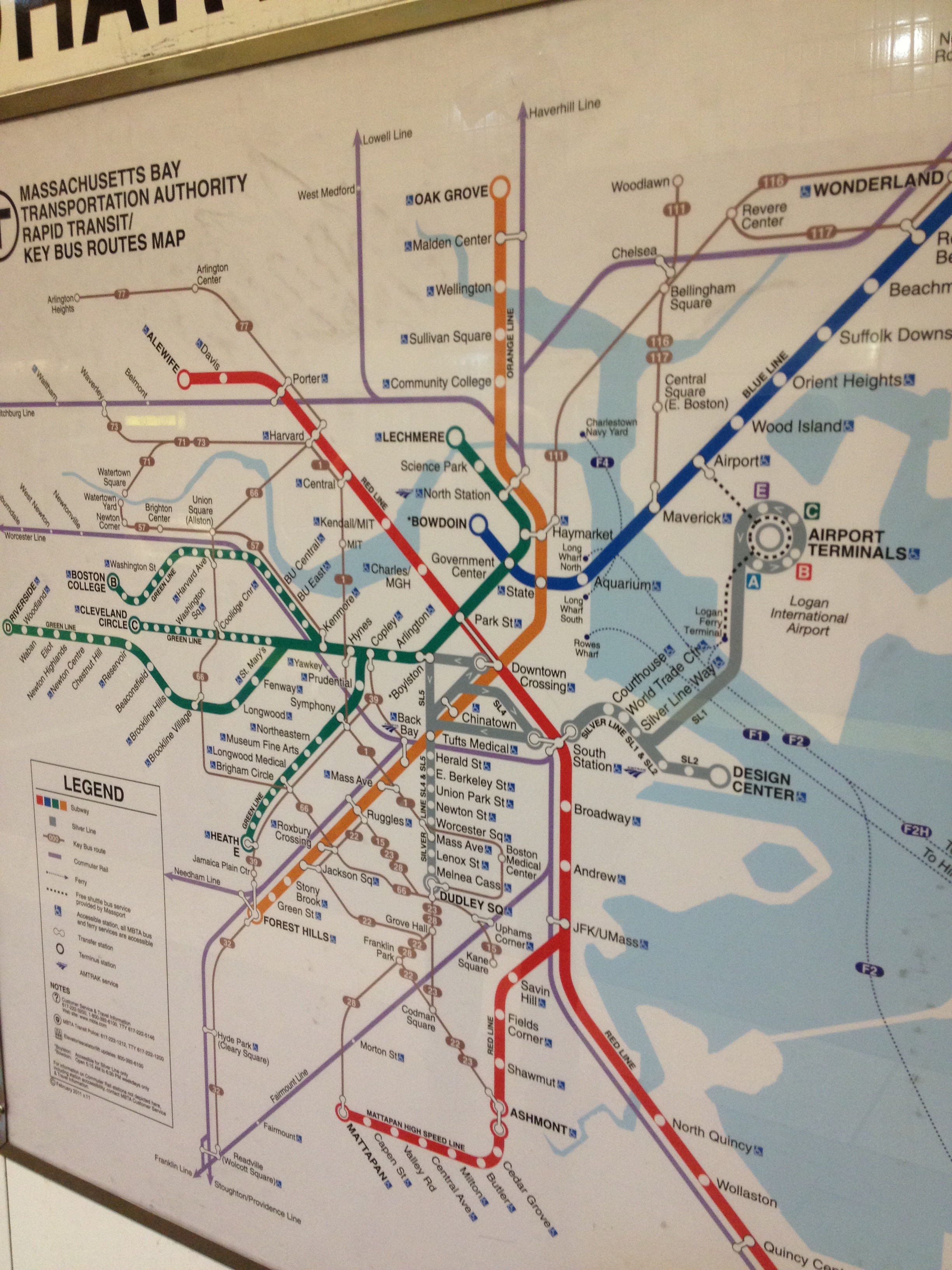
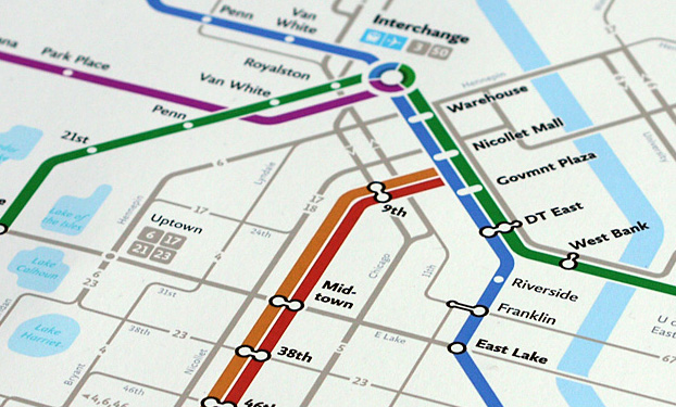
2013-01-21 10.29.16Cartographers have long had a quirky, and sometimes strange, fascination with transit maps. Since the days of Harry Beck and the first London Tube maps, an entire cartographic subculture has grown around them. No longer just limited to metropolitan transit systems, authors and map creators now use them to represent everything from river systems to rock ‘n roll.  Maps are, by definition, abstract visual representations and transit maps are no different. However, transit maps are especially notable. Very few visual graphics can communicate complex messages as quickly and efficiently, distill important features out out of an incredible amount of information with such ease, and seamlessly embed an illustrative sense of place and personality as a transit map. Perhaps most remarkable, and where in lies the fascination, is the abandonment of spatial relation and reliance almost solely on logical relation.

Transit maps are far from
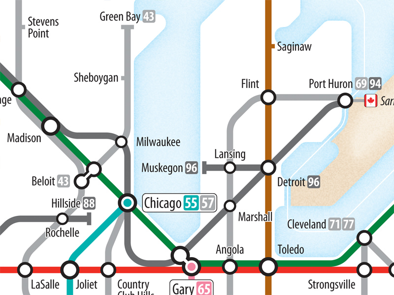
what might publicly be considered a “normal” transportation map. Take the Interstate Tube Map by Cameron Booth for an example. When many think of maps, especially those used for transportation, there is an expected element of spatial accuracy, relation, and scale. One inch is equal to 100 miles… this town is directly south of this town… etc. These principles are bent, skewed, or even completely ignored in transit mapping. A transit map instead relies on points of interest and major landmarks to guide people in and around a community, and cartographers must not only have knowledge of the physical surroundings, but also intricate knowledge of their cultural subject matter.

People use these types of navigational techniques and use logical relation everyday in a process called cognitive cartography, or mental mapping. Mental maps are created in the mind of an individual and represent an individuals point-of-view perception of space within their own world. The most prominent Mental Map researcher was perhaps Kevin Lynch, an Urban Planning Professor at MIT, and the author of The Image of the City. Everyone creates Mental Maps, and they consist of the pictures in our head displaying landmarks used to navigate and way-find through everyday life. Mental maps are highly unique, but within a community there will be certain commonalities. Transit maps offer intrigue because in some ways they are the most mainstream and widely accepted example of mental mapping in the field. They expand beyond the individual, grabbing commonalities and features from many people, and can represent the collective “mental map” of a community.

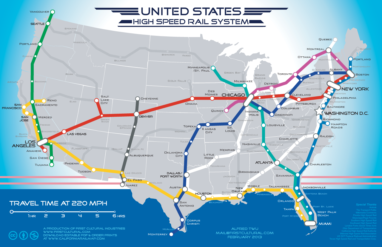
Transit maps can be utilitarian, but because of the extensive use of logical relation, they have an uncanny ability to show dreams and display fantasies with ease. Of course, all maps can do this, but transit maps have the ability to do so with the stroke of a few clean, primary-colored lines. Used correctly, transit maps can be highly effective tools to describe complex concepts in a simple manner, propose large projects, or further an agenda (see some maps made of a dream United States High Speed Rail System).

US-High-Speed-Rail-System-by-FirstCultural-2013-02-03

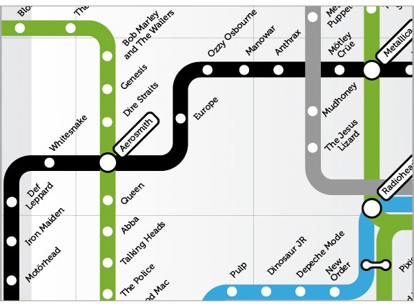
Essentially anything you can assemble into a system can be displayed in a transit map form, such as a collection of water drainage features and rivers, but you can also map the fantastic. Creative cartographers and adventurous authors have mapped everything from classic movies to internet trends to rock n roll.

AlbertoAntoniazzi_RockNRollMap_IMG2

Who knew you could listen to Aerosmith and take the Green Line to Bon Jovi?!  Happy Mapping.

-Mike


(A shoutout to the folks at Carticulate, you don’t even know the number of times I have pointed people to your color-coded skyway map.)

Hey guy, that’s my island!

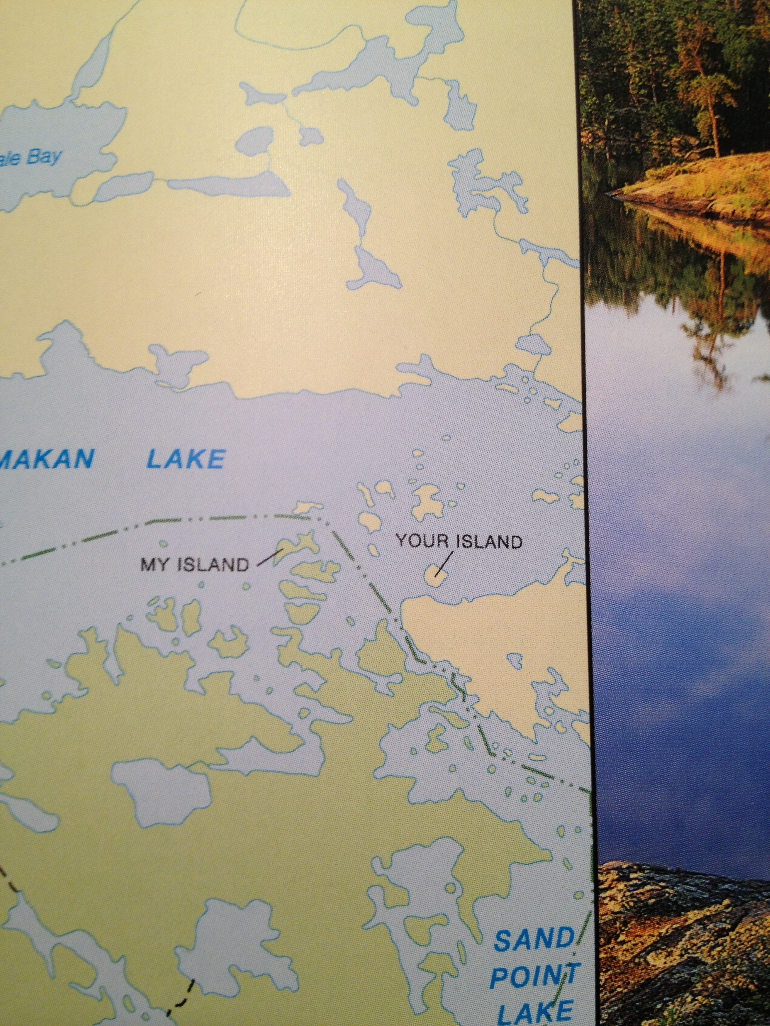
In an attempt to answer a somewhat random trivia question on National Parks the other day I found a book I received a few years ago. Flipping through, it’s a National Geographic coffee table book on America’s National Parks, and is chock full of amazing pictures and maps. My roommate and I were perusing and happened to stumble across these two curious and remote islands deep in Voyageurs National Park, located on the U.S./Canada border.

Mine and Yours

Many authors, academics, and cartographers have written about the idiosyncrasies and quirks in our maps, and even more have written about place names, geopolitics and their associated controversy, notably Mark Monmonier’s book “Drawing the Line: Tales of Maps and Cartocontroversy“, or Miles Harvey’s “The Island of Lost Maps – A True Story of Cartographic Crime“. Place naming and map design give cartographers immense power in defining place, and those designs and place names have fantastic story telling power and an incredible way of telling the history and character of a region.

What happened here?  Why are these islands named this way?  My Island is in the United States, Your Island is in Canada. Were two early voyageurs on this lake, one American and one Canadian (probably both French), standing on each island yelling and claiming things?  The American was clearly dictating right?  That’s why his island became “My Island” and the other became “Your Island”.  But this is an American publication, right?  What does this say about the time?  Or the broader culture?

Maps take you on journeys without ever leaving your desk, office, bedroom, or couch. Much like music, actually.  I find this to be incredibly well stated by Miles Harvey and the following specific excerpt from his book, “The Island of Lost Maps”.

“A map has no vocabulary, no lexicon of precise meanings. It communicates in lines, hues, tones, coded symbols, and empty space, much like music. Nor does a map has its own voice. It is many-tongued, a chorus reciting centuries of accumulated knowledge in echoed chants. A map provides no answers. It only suggests where to look: discover this, reexamine that, put one thing in relation to another, orient yourself, begin here… Sometimes a map speaks in terms of physical geography, but just as often it muses on the jagged terrain of the heart, the distant vistas of memory, or the fantastic landscapes of dreams.

I use a map to get from one place to another in my mind in the same way that someone else might use it get from Omaha to Oskaloosa. It’s a peculiar kind of travel, I admit, but I suspect many others embark on similar journeys”

-Miles Harvey, “The Island of Lost Maps”

What journeys have you gone on?  Happy 2013!